
Why Manhwa Readers Are Drawn to Fantasy-First Character Design
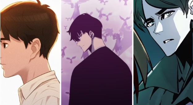
Manhwa has never really tried to blend in. Even when the stories follow familiar themes, the visuals usually do something a little bolder. Bigger expressions. Sharper silhouettes. Characters that feel slightly unreal in an intentional way.
That’s part of the appeal.
Modern manhwa doesn’t just tell stories. It builds worlds that pull readers in visually before a single line of dialogue lands. Fantasy-first character design sits at the center of that experience, and it’s one of the main reasons readers stay hooked.
Fantasy Comes First, Not Accuracy
Manhwa characters aren’t designed to look “correct.” They’re designed to feel something immediately.
Eyes are exaggerated, so emotion reads fast. Bodies are stylized to suggest power, softness, danger, or vulnerability. Faces stretch further than realism allows because subtlety isn’t the goal. Impact is.
Readers don’t have to study a panel to understand the mood. One glance usually does the job. That kind of clarity matters in a medium built around scrolling and momentum.
Fantasy-first design isn’t about ignoring reality. It’s about turning emotion up and letting realism take a back seat.
Stylization Changes How Readers Engage
When characters are clearly stylized, readers stop comparing them to real people. That comparison instinct just… turns off.
Instead of thinking about whether a body looks realistic, readers focus on what the character represents. Authority. Innocence. Obsession. Transformation. Those ideas come through visually without needing explanation.
This is why fantasy genres feel so natural in manhwa. Characters function like symbols as much as individuals. Readers connect faster because the visual language is doing half the storytelling.
Visual Freedom Keeps Characters Memorable
Fantasy-first design gives artists room to push things around. Proportions shift. Anatomy bends. Costumes prioritize drama over practicality. Hair, skin tones, and body features follow aesthetic logic, not real-world rules.
That freedom sticks in readers’ minds.
People remember silhouettes and energy more than detail. They remember how a character felt on the page, not whether their proportions made sense.
You see the same creative instinct in other fantasy-driven art spaces, including communities influenced by furry porn, where imagination matters more than imitation. The goal isn’t realism. Its expression.
Readers Want Worlds They Can Step Into
Manhwa readers aren’t just following plots. They’re entering environments.
Fantasy-first character design works because it matches the worlds these stories live in. Exaggerated architecture. Dramatic lighting. Symbolic clothing. Everything feels intentional.
When characters match the tone of the setting, the world feels coherent. Readers trust it, even when it’s unrealistic. That trust makes long story arcs easier to follow and more rewarding to stay with.
Escapism Works Better Without Comparison
Realistic art invites judgment. Readers subconsciously measure characters against real bodies, real faces, and real expectations.
Fantasy design removes that reflex.
This matters especially in darker, mature, or adult-adjacent genres. When characters are clearly fictional, readers can engage with emotion, power dynamics, or tension without dragging real-world comparisons into it.
That same boundary shows up in fantasy art communities shaped by furry porn, where fictional characters allow exploration without borrowing from real identities. Manhwa benefits from that same separation.
Character Design Carries the Story
In fantasy-first manhwa, character design isn’t decoration. It’s storytelling.
Clothing hints at status. Posture suggests intent. Repeating visual motifs reinforces themes across arcs. Readers learn who a character is before they’re told.
This reduces the need for heavy exposition. The art does the work quietly, panel by panel.
Over time, these visual cues build familiarity. Readers recognize growth or change without needing it spelled out.
Stylization Supports Long-Running Series
Manhwa often runs long. Dozens of chapters. Sometimes hundreds.
Fantasy-first design makes that sustainable. Characters can evolve visually without breaking immersion. Hairstyles change. Costumes shift. Expressions exaggerate or soften as the story progresses.
Those changes feel natural because the art style allows them. Readers notice growth without feeling like the character has become someone else.
Digital Reading Rewards Bold Design
Most manhwa is consumed digitally, usually on phones. Fantasy-first design works better in that format.
Exaggerated features read clearly on small screens. Strong contrast holds attention. Dramatic framing keeps people scrolling.
Realism can get lost in this environment. Stylization cuts through it.
Why This Keeps Resonating
Readers don’t just choose stories. They choose aesthetics that match how they imagine worlds.
Fantasy-first character design offers flexibility. Soft designs. Intense designs. Beautiful designs. Unsettling designs. All can coexist without one being treated as the “correct” choice.
That openness broadens manhwa’s appeal. Readers feel connected not because characters look real, but because they feel right.
And as long as manhwa remains digital-first and imagination-driven, fantasy-first character design isn’t going anywhere.
It gives artists freedom.
It gives readers immersion.
And it gives stories a visual language that realism can’t always provide.
That’s why manhwa readers keep coming back to it.